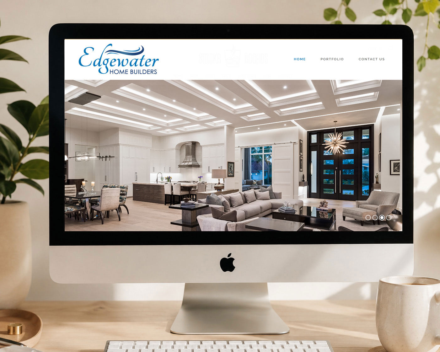
WEB DESIGN
BEAUTIFUL. PROFESSIONAL. MOBILE-FRIENDLY.
We create modern, responsive websites designed around your business, your customers, and the way people browse today.
Our Approach to
Modern Web Design
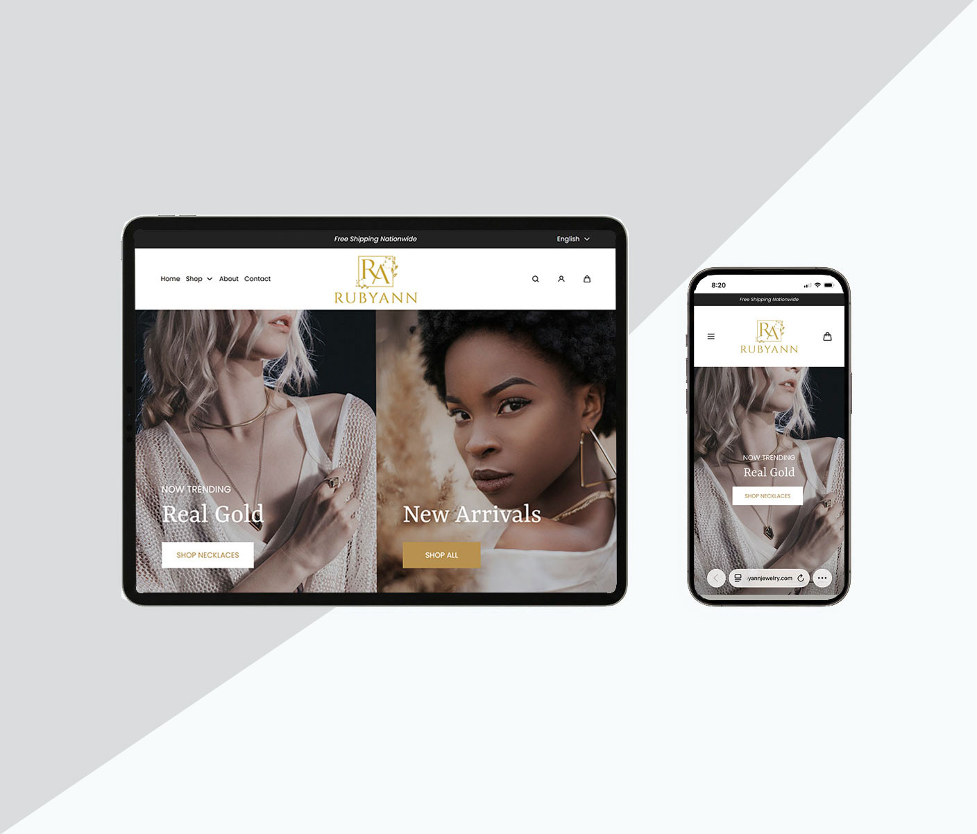
Responsive Web Design Built for Every Device
Your website is often the first impression someone has of your business. It should look polished, load smoothly, and be easy to use whether visitors find you on a desktop, tablet, or smartphone.
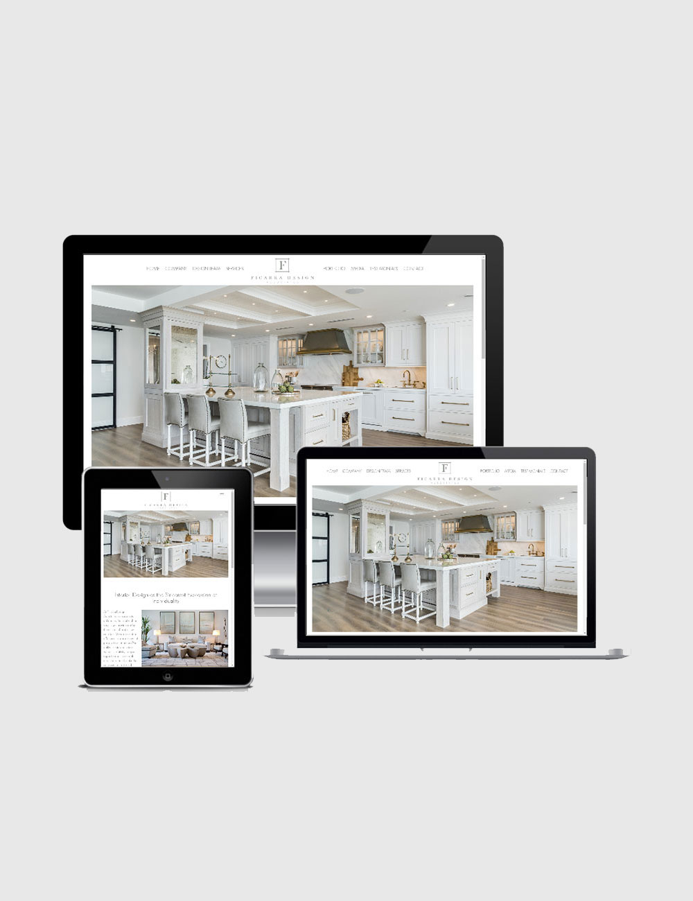
At Studio 239 Design, every website we create is designed with responsive, mobile-friendly functionality from the start. Your layout, images, typography, navigation, and content automatically adapt to different screen sizes, creating a seamless experience across devices.
We consider how people actually interact with your website - from how easily they can find information to how quickly they can take the next step, whether that's contacting you, making a purchase, or requesting a quote.
Designed for People,
Search Engines & AI
Better User Experience
Visitors should be able to navigate your website easily and find what they need regardless of the device they're using. A thoughtful responsive design keeps your content accessible and your brand experience consistent.
Mobile-First Experience
With most people browsing and shopping from their phones, your mobile experience is just as important as on your desktop. We design websites that are easy to read, navigate, and interact with on smaller screens.
SEO & AI Search Ready Foundation
People increasingly use traditional search engines alongside AI-powered tools and answer engines to find businesses, products, and services. We incorporate foundational SEO and AI search optimization into your website through clear content organization, descriptive page content, logical navigation, relevant keywords, structured information, and other best practices that help technology better understand your business.
Designed to Convert
Your website should have a purpose beyond looking good. Strategic calls to action, intuitive navigation, clear messaging, and thoughtful page layouts help guide visitors toward the action you want them to take. Whether it's making a purchase, filling out a contact form, or picking up the phone, we design with your business goals in mind.
A Web Designer
You Can Count On
Your website should look great and work seamlessly whether your customers are browsing on a phone, tablet, laptop, or desktop. Studio 239 Design creates responsive websites with thoughtful design, intuitive navigation, and a strong foundation for SEO and AI search visibility. Let's create a website that makes a great impression on every screen.